Flex-grow 9999 Hack
The Germans broke my CSS a while ago. Well, not literally, but their long words did. A few days before the issue occurred, I saw a talk by Zoe Mickley Gillenwater at Frontend United entitled "Using Flexbox Today". That talk inspired me to solve the problem with flexbox.
Before I explain the flex-grow 9999 hack in detail, let me briefly describe what it does. The flex-grow 9999 hack makes a flex item behave like it has two flex grow values. It prevents a flex item in a row from growing, but allows it to grow if it's wrapped into its own line. All without the use of media queries.
If that didn't make sense, don't worry. The example should make it clear.
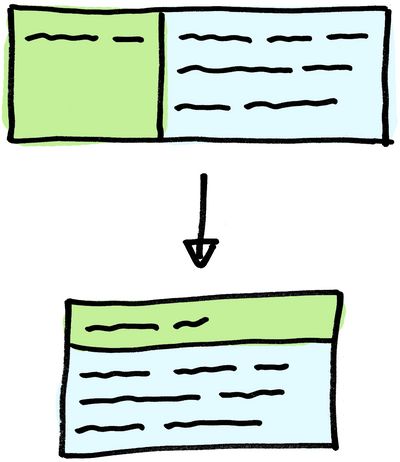
Imagine a flex container (display: flex) with two flex items in a row (flex-direction: row). Item A on the left, and item B on the right. Item A can not grow, so I give it a flex-grow value of 0 (the default value). Item B has to take up all the remaining space in the container. This can be done with flex-grow: 1.
I would like the flex items to be stacked on top of each other when necessary. Item B has to jump onto the second line, if there's not enough space for it to be at least 20 ems wide. Adding flex-wrap: wrap to the container and flex-basis: 20em to item B does the job.
.container {
    display: flex;
    flex-direction: row;
    flex-wrap: wrap;
}

.item-a {
    flex-grow: 0;
}

.item-b {
    flex-grow: 1;
    flex-basis: 20em;
}
You can see what we have so far on JSFiddle.
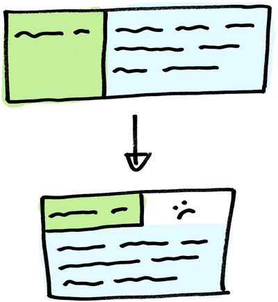
Now comes the tricky part. I want item A to stretch to the entire width of the container, only if the items are wrapped into multiple lines. We could use media queries to update the flex-grow value, but in my case, the breakpoint was hard to define.
Reasons why the breakpoint could be hard to define are:
- The width of item A is unknown. For instance, it contains words that are longer in another language.
- We don't know the width of the components parent element. For instance, if it is used in a sidebar and in some other places.
Let's do this without media queries. We will update the flex-grow value of item A to 1. The problem now is that item A will also grow if both items are next to each other. To fix this, we can assign a ridiculously large flex-grow value like 9999 to item B.
.container {
    display: flex;
    flex-direction: row;
    flex-wrap: wrap;
}

.item-a {
    flex-grow: 1;
}

.item-b {
    flex-grow: 9999;
    flex-basis: 20em;
}
Check out the final result on JSFiddle.
So why does this work? Flex grow defines how much of the remaining free space a flex item receives. Let's say there are 100 pixels of free space left. We can then give item A 1/4 (25px) of the remaining space (flex-grow: 1), and item B 3/4 (75px) of the remaining space (flex-grow: 3).
In our case item A gets 1/10000 of the remaining space, which results in 0 pixels (1 / 10000 * 100 = 0.01). Eventually, if there's enough remaining space, item A will receive some pixels. But you'd need a very large screen for that to happen. You can do the math yourself.
If you want to read a more in depth article on how flex grow works, there's an excellent blog post on css-tricks.com.